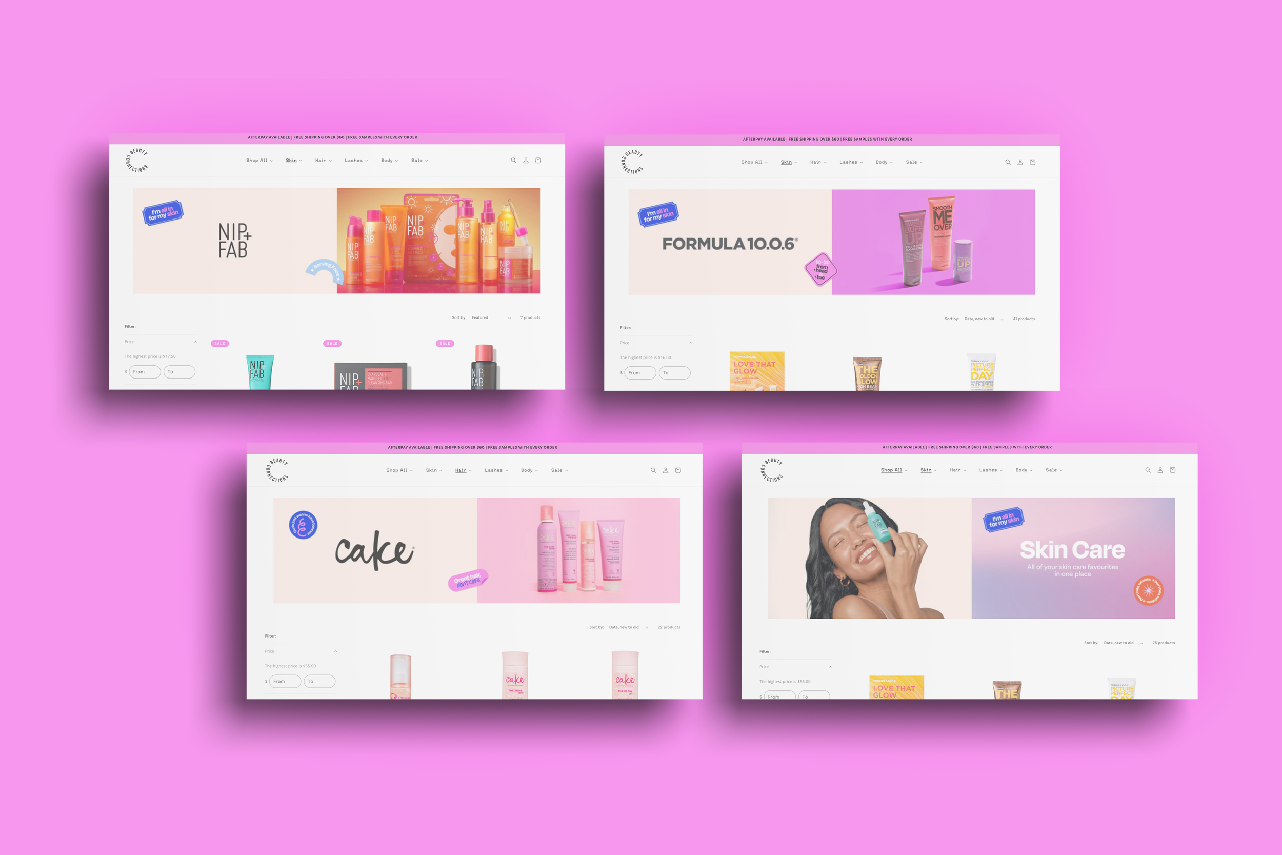
Beauty Connections is an Australian beauty retailer connecting everyone to better beauty through a range of skincare, haircare, and body care products from popular brands such as Ikoo, Cake, Nip+Fab, and Formula 10.0.6.
This project was designed in collaboration with Alma Santang of Studio Full Circle To learn more, please visit www.byfullcircle.com
THE JOB
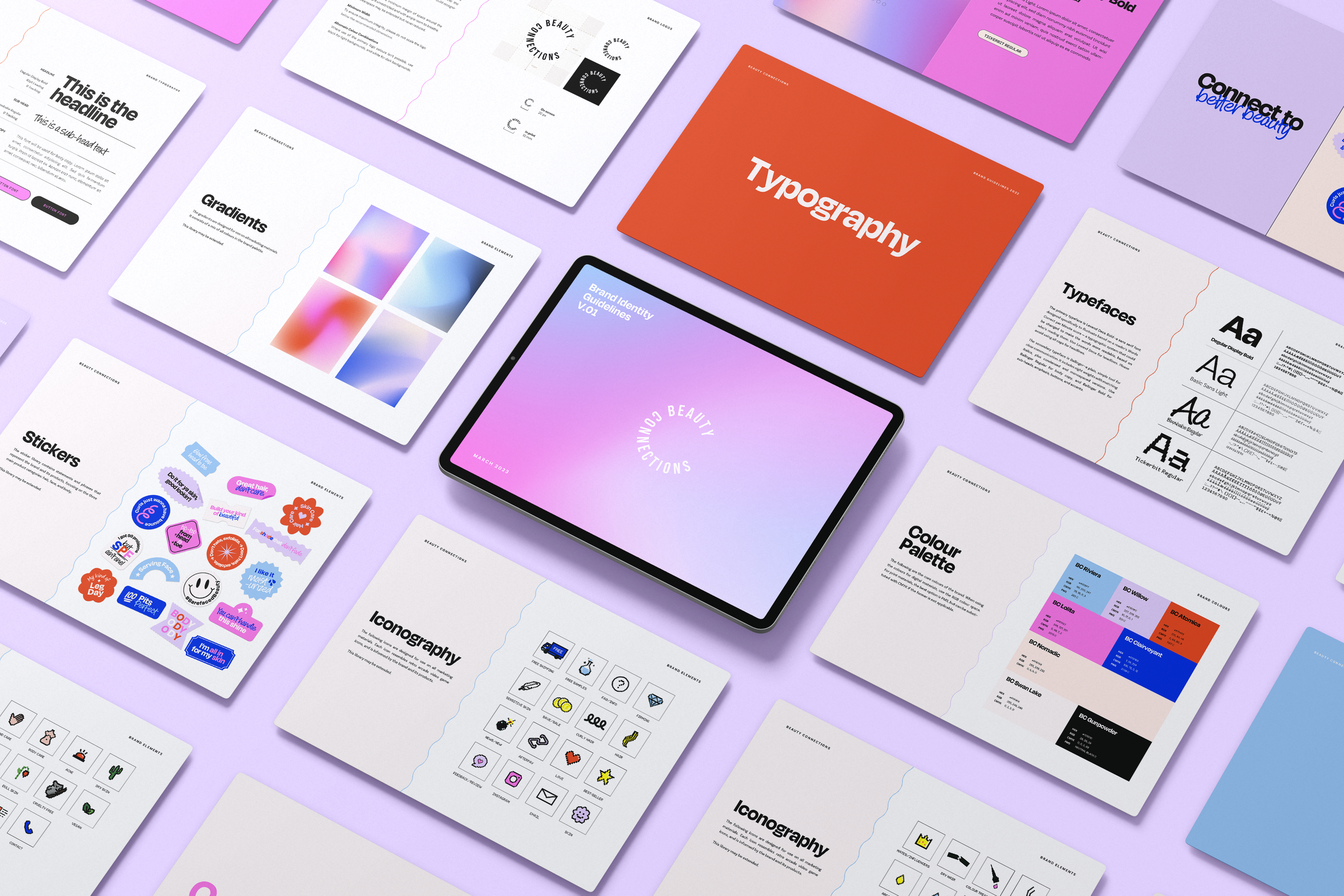
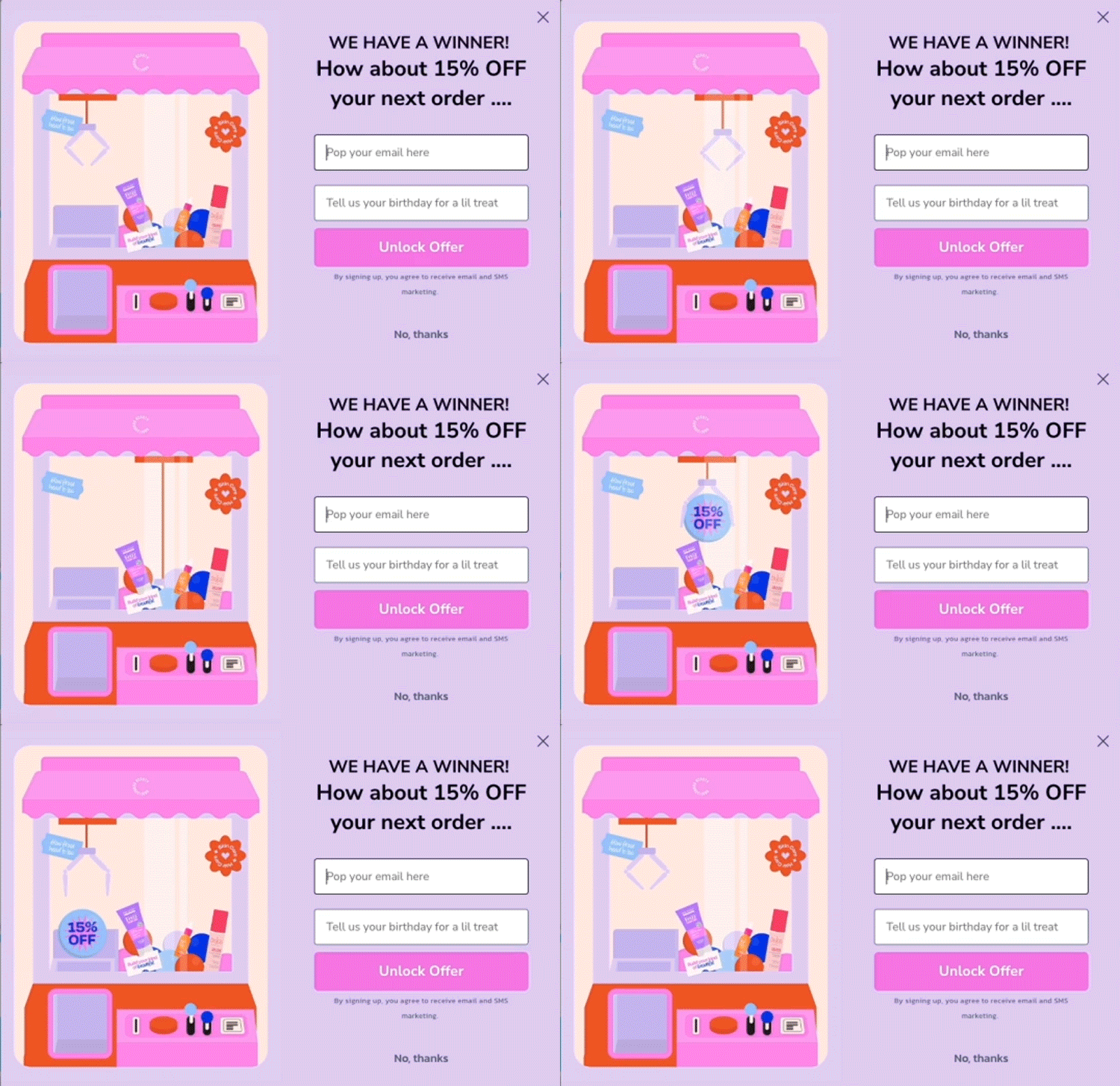
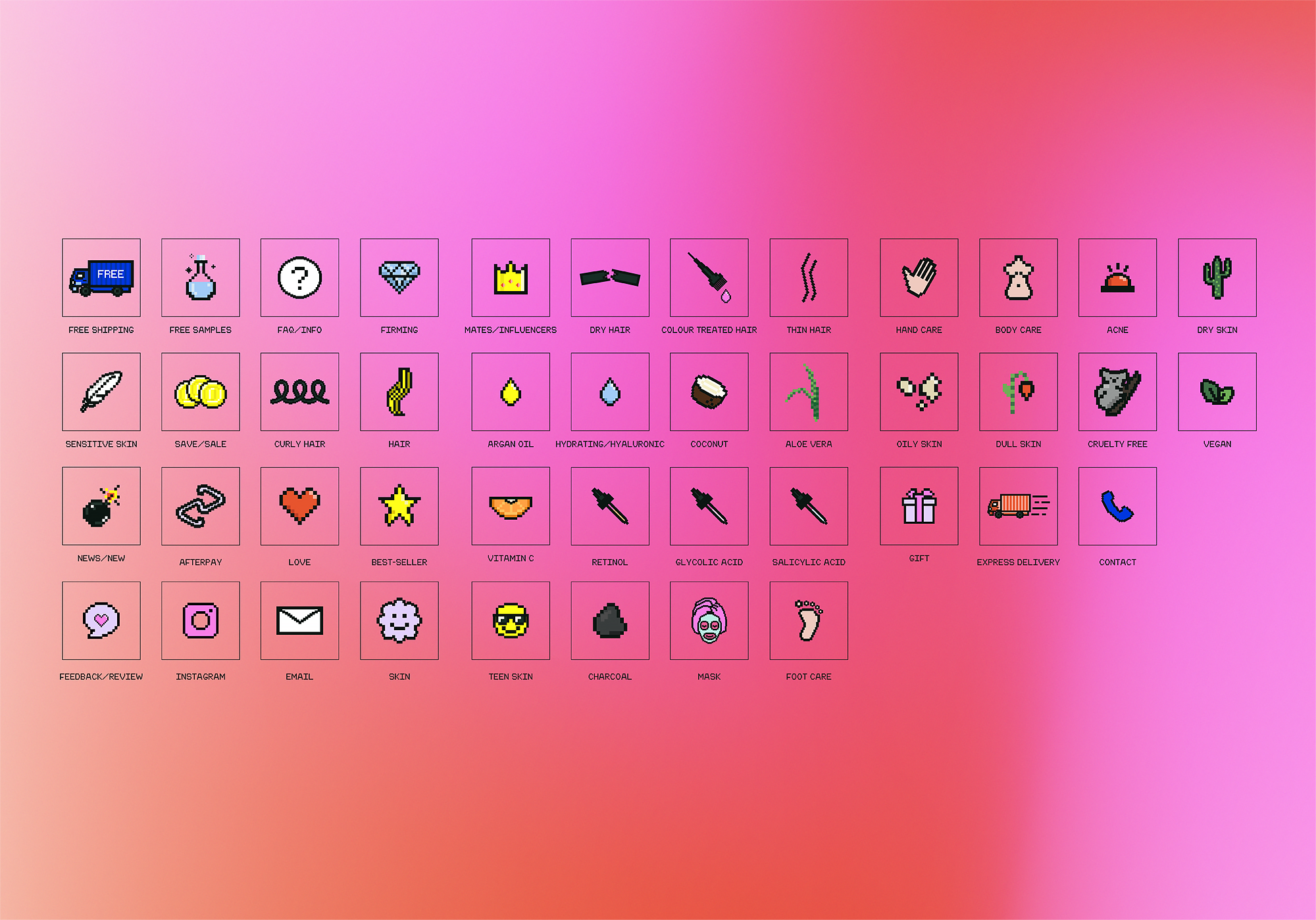
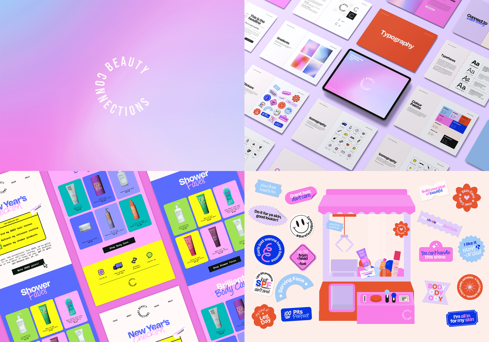
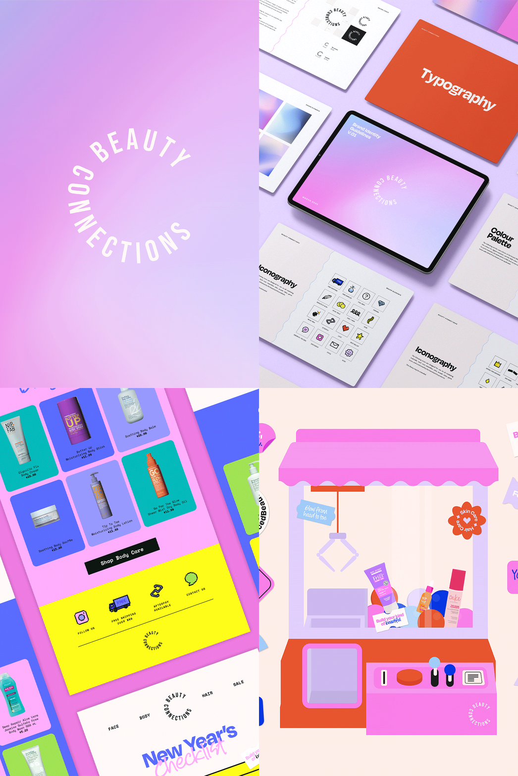
Establishing a brand new arcade-ian rhythm following an exceptionally unique and exciting brief that required an 80s arcade vibe with a modern twist. I remember hopping on the call with Alma of Studio Full Circle for the first time, and having ideas running through my head at crazy speeds. Alma and I brainstormed on what the colors and general feel of the website should look like—fun, but not too kitschy; fresh, but not too youthful. So I prepared two concepts: one loud, one a little softer, but from the get-go, I knew I wanted to use 8-bit icons because nothing else screamed arcade more than those pixelated gems. The contrast between the 8-bit elements, flat illustrations, loud colors, and grainy gradients brought the design brief to life. We’ve made it so that the typography is also a good balance between retro and modern.
THE ROLE
Brand Design, Digital Marketing Design, Copywriting
